Winter Color Analysis Bundle: 5 Checklists for Style
Winter Color Analysis Bundle: 5 Guides & Checklists for Clear, Cool, High-Contrast Style
Winter palettes shine with cool undertones, crisp clarity, and higher contrast. This bundle is designed to turn “I know I’m a Winter… now what?” into a repeatable process: confirm your Winter family, identify your best neutrals and accents, and apply the palette to clothing, makeup, hair, and accessories with simple checklists.
What “Winter” Means in Seasonal Color Analysis
In seasonal color analysis, “Winter” usually points to three core traits: a cool undertone, higher contrast (light vs. dark), and clear or bright color intensity. When those traits are present, colors look sharper and more intentional on you—rather than “almost right.”
Common signs include: black-and-white outfits feeling harmonious, icy tones (like icy pink or icy blue) reading fresh and awake, and warm beige or orange-based shades making the complexion look dull or slightly sallow. Winter is also a family with subtypes, so the goal isn’t to wear every cool color available—it’s to find a tighter “best colors” range that stays consistent across outfits and seasons.
What’s Included in the 5-in-1 Winter Bundle
The bundle is built to help you move from abstract palette ideas to practical decisions you can repeat while shopping, planning outfits, and refining finishing touches. You’ll get guides that explain Winter characteristics and how to test your coloring with side-by-side comparisons, plus printable or digital checklists for wardrobe planning, filtering colors in-store/online, and building outfits without second-guessing.
Bundle at a Glance
| Component | Best for | Typical output |
|---|---|---|
| Winter overview guide | Confirming cool/clear/high-contrast traits | Quick diagnostic checkpoints and examples |
| Subtype guide (Winter families) | Narrowing to a more precise palette | Subtype cues and color “do/don’t” direction |
| Wardrobe color checklist | Editing closets and planning basics | Core neutrals + accent color shortlists |
| Shopping filter checklist | Avoiding wrong undertones in-store/online | Fabric/print/metal screening steps |
| Outfit + finishing checklist | Pulling looks together consistently | Contrast levels, accessories, makeup prompts |
Find Your Winter Subtype Without Overthinking
Subtype work gets easier when you focus on controlled comparisons instead of single-color tests. Start with undertone: if warmth (golden beige, peach, camel) routinely looks “off,” Winter is more likely than warm seasons. Then check clarity: clear jewel tones (fuchsia, cobalt, emerald) often flatter Winters more than dusty, greyed shades.
Next, check contrast. Many Winters naturally handle strong contrast (for example, dark hair with light skin, or striking eye definition), but contrast can also be created through outfit choices even when your natural contrast is moderate. For the most reliable read, compare two similar colors with different undertones—cool pink vs. peach, true navy vs. warm teal—because your face will react more clearly when the only change is temperature and clarity.
Lighting matters as much as the color itself. If you’re testing clothing or makeup at home, try to use consistent, neutral lighting and avoid mixing warm bulbs with daylight. For a deeper look at how lighting affects perceived color, see the CIE’s explanation of Color Rendering Index (CRI) and their overview of colorimetry.
Build a Winter Wardrobe: Neutrals, Accents, and Contrast Rules
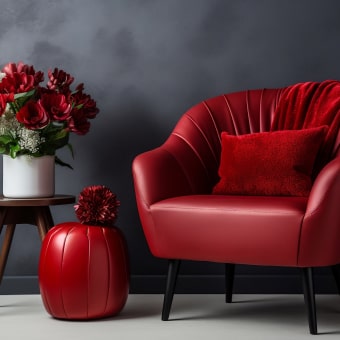
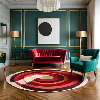
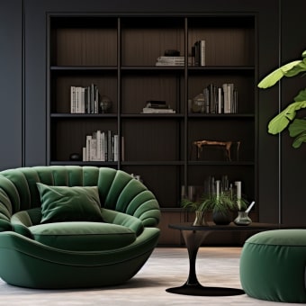
Winter wardrobes usually look best when neutrals are cool and clean rather than creamy or beige-heavy. Neutrals that often work include black, optic white, charcoal, cool navy, cool espresso, and steel grey. Choose depth based on your best contrast level: if pure black feels “too heavy,” charcoal or cool navy may give the same Winter crispness with a slightly softer edge.
For accents, prioritize jewel tones and icy pastels. If you lean bright/clear, saturated jewel tones can feel especially natural. If you lean deeper, you may prefer richer, darker cool shades that still stay crisp rather than smoky or muted. Contrast guidelines are simple but powerful: pair light + dark, use clean color blocking, or add contrast with accessories (belt, shoes, bag, statement earrings). Prints and patterns typically harmonize better when edges are crisp and contrast is higher—think sharp stripes, clear florals, or geometric motifs instead of watercolor effects or muddy, warm-toned blends.
Makeup and Hair Color Notes for Winter Palettes
How to Use the Checklists: A 20-Minute Routine
Who This Bundle Helps Most
Bundle Details and Purchase Link
The Winter Color Analysis Bundle | Seasonal Color Analysis Winter Guides & Checklists 5-in-1 is a digital bundle designed to guide Winter palette decisions using repeatable checklists and practical color tests. It includes five coordinated resources for subtype clarity, wardrobe planning, shopping filters, and finishing touches—so your color choices feel consistent, intentional, and easy to repeat.
More Digital Checklists (In Stock)
- Speak Easy: How to Talk to Anyone with Confidence and Authentic Charm | eBook Guide
- Engine Light Decoded – Check Engine Light Guide, Car Diagnostic eBook
- Comparing Pet Food Like a Pro | Digital Checklist for Pet Parents
FAQ
Can someone be a Winter without looking high-contrast?
Yes. Undertone and clarity can still be cool and crisp even when hair/skin contrast is moderate, and you can create contrast with outfit choices like dark/light pairings, crisp prints, and a stronger lip color.
What’s the fastest way to tell Winter from Summer?
Compare clear jewel tones vs. dusty muted tones near the face. Winters often look more energized in clear, cool colors, while Summers typically look softer and more harmonious in muted, cool shades.
Are black and pure white always the best neutrals for Winter?
They’re often flattering, but not mandatory for every Winter. Many people do better with charcoal and cool navy as primary neutrals, depending on subtype and preferred contrast level.


Leave a comment